|
|

Заголовки
Чтобы создать заголовок, поместите "hn. " в начале строки (где n может быть числом от 1-6).
| Нотации |
Комментарий |
| h1. Самый большой заголовок |
Самый большой заголовок
|
| h2. Больший заголовок |
Больший заголовок
|
| h3. Большой Заголовок |
Большой Заголовок
|
| h4. Нормальный Заголовок |
Нормальный Заголовок
|
| h5. Маленький Заголовок |
Маленький Заголовок
|
| h6. Самый маленький заголовок |
Самый маленький заголовок
|
Эфекты Текста
Эффекты текста используются для того, чтобы изменить форматирование слов и предложений.
| Нотации |
Комментарий |
| *жирный* |
Делает текст жирным.
|
| _выделение_ |
Делает текст выделенным.
|
| ??цитирование?? |
превращает текст в цитату.
|
| -зачеркивание- |
Делает текст зачеркнутым.
|
| +подчеркивание+ |
Делает текст подчеркнутым.
|
| ^Надстрочный^ |
Делает текст надстрочным.
|
| ~Подстрочный~ |
Делает текст подстрочным.
|
| {{текст будет равноширинным}} |
Делает текст code text.
|
| bq. Блок текста в кавычках |
Чтобы заключить целый параграф в кавычки, поместите "bq. " перед ним.
Например:
Блок текста в кавычках
|
{quote}
вот
контент который будет помещен в кавычки
{quote}
|
Взять в кавычки блок текста, который больше одного параграфа.
Например: взять в кавычки
контент, который будет взят в кавычки
|
{color:red}
Смотри, красный текст!
{color}
|
Изменение цвета блока текста.
Пример:
Смотри, красный текст!
|
Разрывы Текста
По большей части, специальные разделители параграфов не требуются - Confluence может разбивать ваши параграфы правильно.
| Нотации |
Комментарий |
| (пустая строка) |
Создает новый параграф |
| \\ |
Создает перенос строки. Требуется не часто, в большинстве случаев Confluence сам создает соответствующие строки для вас. |
| ---- |
Создает горизонтальную линейку |
| --- |
Создает — символ. |
| -- |
Создает – символ. |
Связи
Связи это сердце Confluence, поэтому выучить как быстро их создавать очень важно.
| Нотации |
Комментарий |
[#anchor]
[^attachment.ext]
or
[pagetitle]
[pagetitle#anchor]
[pagetitle^attachment.ext]
or
[spacekey:pagetitle]
[spacekey:pagetitle#anchor]
[spacekey:pagetitle^attachment.ext]
|
Создает внутреннюю связь к указанной странице в требуемом пространстве (или к текущему, если вы не указали никакого пространства). Добавление опционального знака '#' за которым следует имя приведет к специфической закладке на требуемой странице. Также добавление опционального '^' за которым следует имя вложения приведет к связи к вложению требуемой страницы.
Пример:
Заголовок страницы
Если такая страница уже не существует, то это позволит вам создать страницу в текущем пространстве. Созданные сязи страниц будут иметь  после себя. после себя.
Пример:
новая страница
|
[link alias|#anchor|link tip]
[link alias|^attachment.ext|link tip]
or
[link alias|pagetitle|link tip]
[link alias|pagetitle#anchor|link tip]
[link alias|pagetitle^attachment.ext|link tip]
or
[link alias|spacekey:pagetitle|link tip]
[link alias|spacekey:pagetitle#anchor|link tip]
[link alias|spacekey:pagetitle^attachment.ext|link tip]
|
Создает внутреннюю гипертекстовую связь к указанной странице в требуемом пространстве (или в текущем пространстве, если вы не указали никакое пространство), где текстовая связь отличается от актуальной гипертекстовой связи. Вы также можете иметь опциональный метку связи, которая будет выглядеть как строка подсказка. Добавление опционального знака '#', за которым следует имя приведет к специфической закладке на требуемой странице. Также указывая опциональный знак '^', за которым следует имя вложения приведет к связи на вложение требуемой страницы.
Пример:
алиас связи
|
|
[/2004/01/12/Новость]
[spacekey:/2004/01/12/Новость]
|
Создает внутренние гиперсвязи к указанной новости в требуемом пространстве (или текущем, если вы не указали никакого пространства). Вы должны указать дату сообщения в указанном формате /год/месяц/день. Якоря и ссылки текста могут быть добавлен тем же способом, который был описан выше. Если вы пытаетесь связаться с новостью, которая не существует, то связь не будет создана.
Пример:
|
[/2004/01/12]
[spacekey:/2004/01/12]
or
[Имя моей ссылки|/2004/01/12]
[Имя моей ссылки|spacekey:/2004/01/12]
|
Создает внутренние гиперсвязи к виду новости за целый день. Укажите дату, которая вам необходима, в виде год/месяц/день. Заголовок ссылки будет так же, как и с другими ссылками. Имеется возможность получить ссылку на день, в который не было новостей: страница будет пустая.
Примеры:
|
[$12345]
или
[Имя моей ссылки|$12345]
|
Создает ссылку к части контента по внутреннему ID базы данных. в настоящее время это единственный способ привязки к почтовому сообщению.
Примеры:
|
[ключ пространства:]
[Заголовок пользовательской ссылки|ключ пространства:]
|
Создает ссылку к домашней странице пространства, или итоговой странице определенного пространства . Точки связи зависят от конфигурации пространства к которому они привязываются. Если пространство не существует, то ссылка будет нарисована перечеркнутой, чтобы указать, что пространство ошибочное.
Примеры:
|
[~username]
[Заголовок пользовательской ссылки|~username]
|
Создает ссылку странице профиля отдельного пользователя. По умолчанию, будет нарисована с иконкой пользователя и полным именем пользователя, но если вы предоставите текст ссылки, то иконка не будет нарисована. Если пользователь, к которому вы привязываетесь не существует, то ссылка будет нарисована перечеркнутой.
Примеры:
|
[phrase@shortcut]
[текст пользовательской ссылки|phrase@shortcut] |
Создает быструю ссылку к указанному сайту. Быстрые ссылки конфигурируются администратором сайта. Вы можете добавить Заголовок к быстрой ссылке тем же манером, как и к другим ссылкам.
Примеры:
|
[http://confluence.atlassian.com]
[Atlassian|http://atlassian.com] |
Создает ссылку к внешним ресурсам, специальные символы, которые приходят после URL и не являются его частью должны быть отделены пробелом. Внешние ссылки отмечаются иконкой со стрелкой.
Заметьте: [] вокруг внешних ссылок являются опциональными в случае, если вы не хотите использовать алиас для ссылки.
Примеры:
|
| [mailto:legendaryservice@atlassian.com] |
Создает ссылку на email адрес с иконкой «письмо«.
Пример:
 legendaryservice@atlassian.com legendaryservice@atlassian.com
|
[file://c:/temp/foo.txt]
[file://z:/file/on/network/share.txt] |
Это работает только в Internet Explorer
Создает ссылку на файл в вашем компьютере или в сети,на общем устройстве
|
|
{doc:/display/DOC/Confluence+Documentation+Home}Confluence Documentation{doc}
|
A macro that allows you to quickly create links to content at http://confluence.atlassian.com.
|
|
{anchor:имя якоря}
|
Создает якорь закладки внутри страницы. Вы можете создать ссылку прямо к этому якорю. Так ссылка [My Page#here] будет связывать в любом месте на "My Page" где есть макрос {anchor:here} , и ссылка [#there] будет связывать в любом месте в текущей страницы где есть макрос {anchor:there}.
|
Списки
Списка позволяют вам представлять информацию как серию упорядоченных элементов.
| Нотации |
Комментарий |
* some
* буллит
** отступ
** буллиты
* отметки
|
Список маркеров (должен быть в первой колонке). Используйте больше (**) для более глубокого отступа текста.
Пример:
|
- различные
- буллит
- типы
|
Список элементов (с -), несколько строк создают простой список.
Пример:
|
# a
# numbered
# list
|
Пронумерованный список (должен быть в первой колонке). Используйте больше (##, ###) для более глубокого отступа текста.
Пример:
-
- пронумерованный
- список
|
|
# a
|
Вы можете использовать разные типы смешанных вложенных списков:
Пример:
|
{dynamictasklist:thingsToDo}
{dynamictasklist:thingsToDo|showAssignee=false}
{dynamictasklist:thingsToDo|promptOnDelete=false}
|
The Dynamic Tasklist Macro displays a task list which can be modified in the page as it is viewed. Despite the fact that this plugin has an ajax UI, it is still fully versioned like a normal Confluence page.
- showAssignee - (optional) If set to true the assignee will be shown in the tasks.
- width - (optional) The width of the tasklist (default is 640px). To set the width to 400 pixels, set the parameter value to 400px.
- enableLocking - (optional) If set to true, tasks can be locked so other users can not modify.
- autoLockOnComplete (optional) Used in conjunction with enableLocking. Tasks will auto lock when it is completed.
- promptOnDelete - (optional) If set to false there will not be any confirmation prompt when deleting a task.
Пример:
| What you need to type |
What you will get |
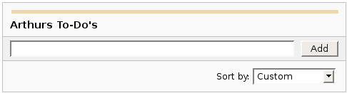
| {dynamictasklist:Arthurs To-Do's} |
|
|
Образы
Изображения могут быть встроены в страницы Confluence из прикрепленных файлов или удаленных источников.
| Нотации |
Комментарий |
!http://www.host.com/image.gif!
или
!attached-image.gif!
|
Вставляет изображение в страницу.
|
!spaceKey:pageTitle^image.gif!
!/2007/05/23/My Blog Post^image.gif!
|
Вставляет изображение, которое прикреплено на другой странице или новости. Если не определено пространство, то используется текущее пространство по умолчанию.
|
| !image.jpg|thumbnail! |
Вставьте миниатюру изображения в страницу (работает только с изображениями прикрепленными к странице). Пользователи могут кликнуть на миниатюру, чтобы увидеть изображение в полный размер. Для этой работы миниатюры должны быть разрешены администратором сайта.
|
| !image.gif|align=right, vspace=4! |
Для любого изображения вы также можете указать атрибуты как пары имя = значение разделенные запятой.
|
{gallery}
{gallery:columns=3}
{gallery:title=Some office photos, and a waterfall|columns=3}
{gallery:title=Some office photos, without the waterfall|exclude=waterfall.jpg}
{gallery:title=One office photo, and a waterfall|include=office1.jpg,waterfall.jpg}
{gallery:title=Some office photos, and a waterfall|page=Gallery of Pictures}
{gallery:title=Some office photos, and a waterfall|page=DOC:Gallery of Pictures}
{gallery:title=Some office photos, and a waterfall|sort=name}
{gallery:title=Some office photos, and a waterfall|sort=date|reverse=true}
|
Create a gallery of thumbnails of all images attached to a page. This will only work on pagesthat allow attachments, obviously. The title parameter allows you to supply a title for the gallery The columns parameter allows you to specify the number of columns in the gallery (by default, 4) The exclude parameter allows you to specify the name of attached images to ignore (i.e., they will not be included in the gallery). You can specify more than one picture, separated by commas. Example: exclude=my picture.png,my picture2.gif The include parameter allows you to specifically include one or more attached images. The gallery will show only those pictures. You can specify more than one picture, separated by commas. Example: include=my picture.png,my picture2.gif The page parameter allows you specify the title of one or more pages which contains the images you want displayed. If a page is in the same space as the page containing the macro, use the format page=My Page Name. To specify a page in a different space, use page=SPACEKEY:My Page Name, such as page=DOC:Gallery Macro. You can specify more than one page, separated by commas. Example: page=Image Gallery,STAFF:Group Photos If a page or attachment file name contains a comma, you can use it in the include, exclude, or page parameters by enclosing it in single or doublequotes. Example: include="this,that.jpg",theother.png The sort parameter allows you to control the order of the images. The options are name,comment, date, or size. The reverse parameter is used in conjunction with the sort parameter to reverse the order of the specified sort. Valid values are true and false. Previous versions of the Gallery macro had an additional slideshow parameter. This is no longer used in the latest version, and the slide show is always enabled. We have left the parameter here for compatibility with older versions of the macro.
|
Таблицы
Таблицы позволяют вам организовать контент в строки и колонки, при необходимости со строкой заголовка.
Расширенное Форматирование
Дополнителное форматирование текста.
| Нотации |
Комментарий |
{code:title=Bar.java|borderStyle=solid}
// Some comments here
public String getFoo()
{
  return foo;
}
{code}
{code:xml}
<test>
    <another tag="attribute"/>
</test>
{code}
|
создает предварительно форматированный блок кода с выделением синтаксиса. Все опциональные параметры макроса {panel} верны и для {code} . Язык по умолчанию Java но вы также можете указать JavaScript, ActionScript, XML, HTML и SQL.
Пример:
public String getFoo()
{
return foo;
}
<test>
<another tag="attribute"/>
</test>
|
{chart:title=Fish Sold}
|| Fish Type || 2004 || 2005 ||
|| Herring | 9,500 | 8,300 |
|| Salmon | 2,900 | 4,200 |
|| Tuna | 1,500 | 1,500 |
{chart}
{chart:type=line|title=Temperatures in Brisbane|yLabel=Celcius
|dataDisplay=true|dataOrientation=vertical}
|| Month || Min || Max ||
| January | 31.3 | 37.5 |
| February | 26.8 | 32.7 |
| March | 25.1 | 28 |
| April | 18.7 | 25.3 |
{chart}
{chart:type=timeSeries|dateFormat=MM.yyyy|timePeriod=Month|
dataOrientation=vertical|rangeAxisLowerBound=0|colors=blue,gray}
|| Month || Revenue ||
| 1.2005 | 31.8 |
| 2.2005 | 41.8 |
| 3.2005 | 51.3 |
| 4.2005 | 33.8 |
| 5.2005 | 27.6 |
| 6.2005 | 49.8 |
| 7.2005 | 51.8 |
| 8.2005 | 77.3 |
| 9.2005 | 73.8 |
| 10.2005 | 97.6 |
| 11.2005 | 101.2 |
| 12.2005 | 113.7 |
|| Month || Expenses ||
| 1.2005 | 41.1 |
| 2.2005 | 43.8 |
| 3.2005 | 45.3 |
| 4.2005 | 45.0 |
| 5.2005 | 44.6 |
| 6.2005 | 43.8 |
| 7.2005 | 51.8 |
| 8.2005 | 52.3 |
| 9.2005 | 53.8 |
| 10.2005 | 55.6 |
| 11.2005 | 61.2 |
| 12.2005 | 63.7 |
{chart}
|
Displays a chart using data from the supplied table or tables.
- Chart type parameters - These parameters change what type of chart to display and the way the chart looks.
- Display control parameters
- width - The width of the chart in pixels (default is '300')
- height - The height of the chart in pixels (default is '300')
- dataDisplay - Default is false to not display the rendered body of the macro (usually the data tables). When dataDisplay=true or dataDisplay=after, the data will be displayed after the chart. When dataDisplay=before, the data will be displayed before the chart.
- imageFormat - Default is png. Format of generated image. Valid formats are png and jpg. Other formats may be also be valid if installed on your server.
- Title and label customization parameters
- title - The title of the chart.
- subTitle - A subtitle for the chart using a smaller font.
- xLabel - The label to use for the x (domain) axis
- yLabel - The label to use for the y (range) axis
- legend - A legend will be displayed unless legend=false is specified.
- Data specification parameters - The data for the chart is taken from tables found when the macro body is rendered. These options control how this data is interpreted. By default, numeric and date values are interpreted according to the Confluence global default language (locale) formats. If conversion fails, other languages defined to Confluence will be tried. Additional conversion options can be specified using the parameters below.
- tables - Comma separated list of table ids and/or table numbers contained within the body of the macro that will be used as the data for the chart. Defaults to all first level tables. If data tables are embedded in other tables, then table selection will be required. This occurs when more complex formatting is done (for example using section and column macros).
- columns - Comma separated list of column labels and/or column titles and/or column numbers for tables used for chart data. This applies to all tables processed. Defaults to all columns. Columns are enumerated starting at 1. Column label is the text for the column in the header row. Column title is the (html) title attribute for the column in the header row.
- dataOrientation - The data tables will be interpreted as columns (horizontally) representing domain and x values unless 'dataOrientation=vertical'.
- timeSeries - If 'true', the x values in an XY plot will be treated as time series data and so will be converted according date formats.
- dateFormat - For time series data, the date format allows for additional customization of the conversion of data to date values. By default, the Confluence language defined date formats will be used. If a dateFormat is specified, it will be the first format used to interpret date values. Specify a format that matches the format of the time series data. See Date Format.
- timePeriod - Specify the time period for time series data. Default is 'Day'. This defines the granularity of how the data is interpreted. Valid values are: Day, Hour, Millisecond, Minute, Month, Quarter, Second, Week, Year.
- language - If provided, the language and country specification will be used to create additional number and date formats to be used for data conversion. This specification will be used before the default languages automatically used. Valid values are 2 character ISO 639-1 alpha-2 codes.
- country - Used in combination with the language parameter. Valid values are 2 character ISO 3166 codes.
- forgive - Default is true to try to convert numeric and date values that do not totally match any of the default or user specified formats. Specify forgive=false to enforce strict data format. Data format errors will cause the chart to not be produced.
- Color customization parameters - See Colors for how to specify colors.
- bgColor - Color (default is 'white') to use as the background of the chart.
- borderColor - Color of a border around the chart. Default is to not show a border.
- colors - Comma separated list of colors used to customize category, sections, and series colors.
- Axis customization parameters - Depending on the chart type, the range and domain axis may be customized. These values are automatically generated based on the data but can be overridden by specifying one or more more of these paramters.
- rangeAxisLowerBound - range axis lower bound
- rangeAxisUpperBound - range axis upper bound
- rangeAxisTickUnit - range axis units between axis tick marks
- rangeAxisLabelAngle - angle for the range axis label in degrees
- domainAxisLowerBound - domain axis lower bound. For a date axis, this value must be expressed in the date format specified by the dateFormat parameter. (Only used in XY Plots, standard charts will have no effect)
- domainAxisUpperBound - domain axis upper bound. For a date axis, this value must be expressed in the date format specified by the dateFormat parameter. (Only used in XY Plots, standard charts will have no effect)
- domainAxisTickUnit - domain axis units between axis tick marks. For a date axis, this value represents a count of the units specified in the timePeriod parameter. The time period unit can be overridden by specifying a trailing character: y for years, M for months, d for days, h for hours, m for minutes, s for seconds, u - milliseconds. (Only used in XY Plots, standard charts will have no effect)
- domainAxisLabelAngle - angle for the domain axis label in degrees. (Only used in XY Plots, standard charts will have no effect)
- categoryLabelPosition - allows axis label text position for categories to be customized
- up45 - 45 degrees going upward
- up90 - 90 degrees going upward
- down45 - 45 degrees going downward
- down90 - 90 degrees going downward
- dateTickMarkPosition - placement of the date tick mark
- start (default) - tick mark is at the start of the date period
- middle - tick mark is in the middle of the date period
- end - tick mark is at the end of the date period
- Pie chart customization parameters
- pieSectionLabel - Format for how pie section labels are displayed. :
- %0% is replaced by the pie section key.
- %1% is replaced by the pie section numeric value.
- %2% is replaced by the pie section percent value.
Example 1: "%0% = %1%" would display something like "Independent = 20"
Example 2: "%0% (%2%)" would display something like "Independent (20%)"
- pieSectionExplode - Comma separated list of pie keys that are to be shown exploded. Defaults to no exploded sections. Note: requires jFreeChart version 1.0.3 or higher.
- Attachment parameters - These are advanced options that can be used for chart versioning, automation enablement, and to improve performance. Use these options carefully! Normally, the chart image is regenerated each time the page is displayed. These options allow for the generated image to be saved as an attachment and have subsequent access re-use the attachment. This can be useful especially when combined with the cache macro to improve performance. Depending on the options chosen, chart images can be versioned for historical purposes.
- attachment - Chart image will be saved in a attachment.
- ^attachment - chart.macro.param.attachment.attachment
- page^attachment - The chart is saved as an attachment to the page name provided.
- space:page^attachment - The chart is saved as an attachment to the page name provided in the space indicated.
- attachmentVersion - Defines the the versioning mechanism for saved charts.
- new - (default) Creates new version of the attachment.
- replace - Replaces all previous versions of the chart. To replace an existing attachment, the user must be authorized to remove attachments for the page specified.
- keep - Only saves a new attachment if an existing export of the same name does not exist. An existing attachment will not be changed or updated.
- attachmentComment - Comment used for a saved chart attachment.
- thumbnail - Default is false. If true, the chart image attachment will be shown as a thumbnail.
Colors can be specified by name or hex value. See Web-colors. The following are the valid color names that will automatically be converted.
| Color |
Hexadecimal |
Color |
Hexadecimal |
Color |
Hexadecimal |
Color |
Hexadecimal |
| black |
#000000 |
silver |
#c0c0c0 |
maroon |
#800000 |
red |
#ff0000 |
| navy |
#000080 |
blue |
#0000ff |
purple |
#800080 |
fuchsia |
#ff00ff |
| green |
#008000 |
lime |
#00ff00 |
olive |
#808000 |
yellow |
#ffff00 |
| teal |
#008080 |
aqua |
#00ffff |
gray |
#808080 |
white |
#ffffff |
Copied from Java SimpleDateFormat specification.
Date and time formats are specified by date and time pattern strings. Within date and time pattern strings, unquoted letters from 'A' to 'Z' and from 'a' to 'z' are interpreted as pattern letters representing the components of a date or time string. Text can be quoted using single quotes (') to avoid interpretation. "'" represents a single quote. All other characters are not interpreted; theyre simply copied into the output string during formatting or matched against the input string during parsing.
The following pattern letters are defined (all other characters from 'A' to 'Z' and from 'a' to 'z' are reserved):
Pattern letters are usually repeated, as their number determines the exact presentation.
- Text:
For formatting, if the number of pattern letters is 4 or more, the full form is used; otherwise a short or abbreviated form is used if available. For parsing, both forms are accepted, independent of the number of pattern letters.
- Number:
For formatting, the number of pattern letters is the minimum number of digits, and shorter numbers are zero-padded to this amount. For parsing, the number of pattern letters is ignored unless its needed to separate two adjacent fields.
- Year:
For formatting, if the number of pattern letters is 2, the year is truncated to 2 digits; otherwise it is interpreted as a number.
For parsing, if the number of pattern letters is more than 2, the year is interpreted literally, regardless of the number of digits. So using the pattern "MM/dd/yyyy", "01/11/12" parses to Jan 11, 12 A.D. For parsing with the abbreviated year pattern ("y" or "yy"), SimpleDateFormat must interpret the abbreviated year relative to some century. It does this by adjusting dates to be within 80 years before and 20 years after the time the SimpleDateFormat instance is created. For example, using a pattern of "MM/dd/yy" and a SimpleDateFormat instance created on Jan 1, 1997, the string "01/11/12" would be interpreted as Jan 11, 2012 while the string "05/04/64" would be interpreted as May 4, 1964. During parsing, only strings consisting of exactly two digits, will be parsed into the default century. Any other numeric string, such as a one digit string, a three or more digit string, or a two digit string that isnt all digits (for example, "-1"), is interpreted literally. So "01/02/3" or "01/02/003" are parsed, using the same pattern, as Jan 2, 3 AD. Likewise, "01/02/-3" is parsed as Jan 2, 4 BC.
- Month:
If the number of pattern letters is 3 or more, the month is interpreted as text; otherwise, it is interpreted as a number.
- General time zone:
Time zones are interpreted as text if they have names. For time zones representing a GMT offset value, the following syntax is used:
     GMTOffsetTimeZone:
             GMT Sign Hours : Minutes

     Sign: one of
             + -
     Hours:
             Digit
             Digit Digit

     Minutes:
             Digit Digit
     Digit: one of
             0 1 2 3 4 5 6 7 8 9
Hours must be between 0 and 23, and Minutes must be between 00 and 59. The format is locale independent and digits must be taken from the Basic Latin block of the Unicode standard. For parsing, RFC 822 time zones are also accepted.
- RFC 822 time zone:
For formatting, the RFC 822 4-digit time zone format is used:
     RFC822TimeZone:
             Sign TwoDigitHours Minutes
     TwoDigitHours:
             Digit Digit
TwoDigitHours must be between 00 and 23. Other definitions are as for general time zones. For parsing, general time zones are also accepted.
|
{widget:url=http://au.youtube.com/watch?v=cOE8ukQoz6E}
{widget:url=http://au.youtube.com/watch?v=cOE8ukQoz6E | width=500 | height=400}
|
Widget Connector
|
|
{content-by-user:fred}
|
Показывает простую таблицу всего контента (страницы, комментарии, сообщения в блок, профили пользователя и описания пространства) созданные пользователем (здесь это 'fred').
|
|
{index}
|
показывает индекс всех страниц в текущем пространстве, с кросс связями и в алфавитном порядке.
|
{include:Home}
{include:FOO:Home}
{include:spaceKey=FOO|pageTitle=Home}
|
Включает одну страницу в другую (этот пример включает страницу ,названную "Home"). Страницы из другого пространства могут быть включены посредством введения заголовка страницы с пробелом и двоеточием.
Пользователь просматривающий страницу должен иметь разрешение для просмотра страницы или она не будет показана.
|
{note:title=Be Careful}
The body of the note here..
{note}
|
Prints a simple note to the user.
- title: - (optional) the title of the note.
- icon: - (optional) if "false", dont display the icon.
|
{warning:title=Warning}
Insert warning message here!
{warning}
|
Prints a warning note to the user.
- title: - (optional) the title of the warning.
- icon: - (optional) if "false", dont display the icon.
|
{info:title=Be Careful}
This macro is useful for including helpful information in your confluence pages
{info}
|
Prints an informational note.
- title: - (optional) the title of the information box.
- icon: - (optional) if "false", dont display the icon.
|
{tip:title=Handy Hint}
Join the Confluence Mailing-List!
{tip}
|
Prints a helpful tip for the user.
- title: - (optional) the title of the tip.
- icon: - (optional) if "false", dont display the icon.
|
{graph-from-table}
| A | B |
| A | C |
{graph-from-table}
{graph-from-table}
|| heading 1 ignored || heading 2 ignored ||
| A node | B node | label="relationship 1", style=dashed | style=normal | fillcolor=lightblue |
| A node | C node |
| A node | D node | style=invis |
{graph-from-table}
{graph-from-table:node=fillcolor=lightblue,fontsize=20|edge=style=bold,color=red|
replace=key1:'style=dashed, color=blue', key2:style=invis|ranksep=2.0}
| A node | B node | | shape=polygon,sides=8,peripheries=3 | |
| A node | B node | | style=dashed |
| A node | C node |
| A node | D node | key2 |
Here is a second table
| E | F | key1 |
| F | G | key1 |
{graph-from-table}
{graph-from-table:direction=LR|ranksep=1.5|node=fillcolor=lightblue,fontsize=20|
edge=style=bold,color=red|replace=key1:style=dashed}
| A node | B node | label="r1" | | | cluster 1 | key1 |
| F | G | key1 | | | cluster 1 |
| X | Y | key1 | | | cluster 1 | | big cluster |
{graph-from-table}
{graph-from-table:direction=LR|edge=color=blue|displayData=true}
{sql:dataSource=ConfluenceDS}
select PARENTID, TITLE from CONTENT where PARENTID is not NULL
{sql}
{graph-from-table}
|
Converts a table into a Graphviz graph by rendering the body of the macro and then converting each row
in each table to a node relationship. A flowchart macro is used for the rendering. This macro simplifies use
of the Graphviz support by eliminating or significantly reducing the need to know the dot language.
Advanced users will still need to consult the Graphviz documentation for the multitude of attributes and settings that
are possible.
The table or tables specified in the body of the macro can be wiki markup or created as a result of other macros.
Specifically, the sql, csv, and excel macros can be used to produce the tables.
The columns in the table are interpreted as follows:
- Node with label equal to the column. The source of a relationship.
- Node with label equal to the column. The target of a relationship.
- Relationship attributes.
- Source node attributes.
- Target node attributes.
- First cluster label. A cluster is a subgraph that contains the source and target nodes for this row.
- First cluster attributes. For instance, if you do not want a label to show for the cluster, put label=""
- Second cluster label. The second cluster is a subgraph that contains the first cluster.
- Second cluster attributes.
Attributes are defined by Graphviz for nodes, relationships, and subgraphs (clusters).
They are specified as comma separated list. Attribute values containing blanks must be surrounded by double quotes.
Some commonly used attributes are:
- label - text to display
- style - examples: filled, bold, dotted, dashed, invis (for invisible)
- fillcolor - node fill color
- fontname - standard font name (enclosed in double quotes if contains a blank)
- fontsize - standard font size
- fontcolor - color usually specified as a color name like blue, grey, lightyellow
- shape - examples: rect, box, circle, ellise, triangle, polygon (together with sides attibutes), diamond, ...
- sides - number of sides for a polygon shape
- peripheries - number of node boundaries
References:
Parameters - all are optional:
- displayData - Default is false. Set to true to show the rendered body data after the graph.
This is useful to see the results of a sql macro for instance.
- node - The default node attributes are: shape=rect, style=filled, fillcolor=lightyellow, fontname="Verdana", fontsize=9.
The default attributes are taken from the default flowchart macro behavior.
By specifying the node parameter, you can override these defaults or add additional default attributes.
See the Graphviz Documentation
for information on attributes and settings.
- edge - The default edge attributes are: arrowsize=0.8.
The default attributes are taken from the default flowchart macro behavior.
By specifying the edge parameter, you can override these defaults or add additional default attributes.
See the Graphviz Documentation
for information on attributes and settings.
- direction - The default layout direction is top to bottom (TB).
Set direction=LR to layout in a left to right direction.
This is equivalent to the rankdir setting.
- tables - Comma separated list of table ids and/or table numbers contained within the body of the macro
that will be used as the data for the graph.
Defaults to all tables found in the body.
- columns - Allows selection of the columns of the table that will be used for the graph.
It must be a comma separated list of 1 or more positive integers in any order.
The default is columns=1,2,3,4,5,6,7,8,9.
If the table does not contain the column indicated, it will be ignored.
For example, if columns=3,13 then column 3 will be used for the source node and column 13 will
be used for the target node of the relationship. All other columns will be ignored.
- replace - A comma separated list of key:value pairs that will be used to convert column values to attributes.
If a column value for an attribute column matches one of the keys, the associated value will
replace the column value. This makes it easy to associate attributes to column data.
If more than one attribute needs to be specified for a key, enclose the value in a single quote
so that the comma gets treated as a attribute separator.
- ... - All other parameters are passed through to Graphviz for setting any global Graphviz parameter.
Some common examples are:
- ranksep - Separation in inches between nodes.
- bgcolor - Background color.
- size - Size specified as width, height in inches. Example: size="3,5".
|
{graphviz}
digraph {
A -> B
A -> C
C -> D
}
{graphviz}
|
Displays a graph drawn using the GraphViz language.
|
{flowchart}
A -> B
A -> C
C -> D
{flowchart}
|
Displays a flowchart diagram drawn using the GraphViz language. Some defaults are set to
match the Confluence look.
|
{noformat}
предварительно отформатированый кусок текста
 так *не* форматированный в дальнейшем сделан здесь
{noformat}
|
Делает предварительно отформатированный блок текста с не выделенным синтаксисом. Все опциональные параметры макроса {panel} верны и для {noformat}.
- nopanel: Если значение "nopanel" равно true, то выдержка будет выведена без окружающей панели.
Пример:
|
{panel}Some text{panel}
{panel:title=My Title}Some text with a title{panel}
{panel:title=My Title| borderStyle=dashed| borderColor=#ccc| titleBGColor=#F7D6C1| bgColor=#FFFFCE}
a block of text surrounded with a *panel*
yet _another_ line
{panel}
|
Охватывает блок текста в панели полностью настраиваемой пользователем. Опциональные параметры, которые вы можете определить, следующие:
- title: Заголовок панели
- borderStyle: Стиль границы, который использует эта панель (сплошной, пунктирный и другие CSS стили границ)
- borderColor: Цвет границы, который использует эта панель
- borderWidth: Ширина границы, которую использует эта панель
- bgColor: Цвет фона этой панели
- titleBGColor: Цвет фона заголовка этой панели
Example:
My Title
a block of text surrounded with a panel
yet another line
|
Контент Confluence
Способы включения, рюземирования и отсылки к другим контентам Confluence.
| Нотации |
Комментарий |
!quicktime.mov!
!spaceKey:pageTitle^attachment.mov!
!quicktime.mov|width=300,height=400!
!media.wmv|id=media!
|
Вставляет объект в страницу, принимая свойства разделенные запятой.
Форматы, поддерживаемые по умолчанию:
Другие типы файлов могут быть использованы, но могут потребовать спецификации свойств "classid", "codebase" and "pluginspage" для того, чтобы быть опознанными вэв браузерами.
Общие свойства:
- width - ширина медиа файла
- height - высота медиа файла
- id - ID назначенное встроенному объекту
Для обеспечения безопасности, файлы размещенные на удаленных серверах, запрещены
Дизайн
По умолчанию, каждый встроенный объект заворачивается в "div" тэг. Если вы хотите модифицировать div и его контент, перепешите CSS класс "embeddedObject". Указание ID как свойства также позволяет по-разному вам модифицировать различные встроенные объекты. Используются имена класса CSS в формате "embeddedObject-ID".
|
|
{attachments:patterns=.*doc|old=true}
|
Prints a list of attachments
- patterns: - (optional) a comma separated list of regular expressions. Only file names matching one of these are displayed.
- old: - (optional) if "true", display old versions of attachments as well.
- upload: - (optional) if "true", allow the upload of new attachments.
|
|
{bookmarks}
|
Displays a list of bookmarks using the criteria supplied.
Searching Options
- spaces comma separated list of spaces to search for. Meta space names @all, @personal, @global can also be used. (If no labels and spaces are supplied will default to current space.)
- labels list of labels that are applied to the bookmarks. (If multiple labels are specified bookmarks only have to match one label to be included.)
- creators comma separated list of users that have created bookmarks.
Sorting Options
- sort comma separated list of attributes to sort the bookmarks by. Valid values are:
- creation Bookmark Created Date
- creator Bookmark Creator Name
- title Bookmark title
Default is by created date.
- reverseSort Reverse the order of the bookmarks. Default is false.
Display Options All options default to true.
-
showAuthor
The user that created the bookmark.
-
showDate
The relative date the bookmark was created.
-
showDescription
The bookmark description.
-
showEditLinks
If the current user has permission, show quick links to edit or remove the bookmark.
-
showLabels
The labels for the bookmark.
-
showListHeader
The bookmark list header (with the rss feed link).
-
max
The maximum number of bookmarks to display. Defaults to 15.
-
showSpace
The space the bookmark is saved in
-
showViewLink
A link to the actual bookmark page
|
|
{pagetree}
{pagetree:root=PageName}
{pagetree:root=PageName|sort=natural|excerpt=true|reverse=false}
{pagetree:root=@home|startDepth=3}
{pagetree:searchBox=true}
{pagetree:expandCollapseAll=true}
|
Provides page hierachal tree within a space. If no parameters are specified the root of the tree will
be the home page, a different root page can be specified by providing the page to the root
parameter.
- root: - (optional) page where the tree would be rooted from. Meta root names @self, @parent, @home can also be used.
- sort: - (optional) sorts the tree node. It my be one of the following: bitwise, creation, modified, natural, position. Default sorting is position
- excerpt: - (optional) true/false flag that indicate if a page excerpt would be included in the tree display (default is false).
- reverse: - (optional) true/false flag that allows you to reverse the order of the display (default is false).
- searchBox: - (optional) true/false flag that allows you to add a search box in the tree that would search from the root page (default is false).
- expandCollapseAll: - (optional) true/false flag that allows you to add an expand all and a collapse all row (default is false).
- startDepth: - (optional) a number that indicates the initial depth that the tree would display (default value is 1).
|
|
{pagetreesearch}
{pagetreesearch:rootPage=PageName}
{pagetreesearch:rootPage=Space:PageName}
|
Provides a search box to search a page hierachal tree within a space.
If no parameters are specified the root of the tree will be the current
page, a different root page can be specified by providing the page to the rootPage parameter.
|
{toc:style=disc|indent=20px}
{toc:outline=true|indent=0px|minLevel=2}
{toc:type=flat|separator=pipe|maxLevel=3}
|
Creates a Table of Contents for headings on the the current page.
- type - (optional) The type of output. May be one of the following:
- list - (default) The headings are output in hierarchical list format.
- flat - The headings are listed on a single line with a separator between them.
- class - (optional) If specified, the TOC will be output with the specified CSS class. Also, if set, no other style values will be output.
- style - (optional) The style of the list items if in list mode. The style may be any of the following:
- none - (default) Headings are output in indented lists with no bullet points or numbers prefixing them.
- any CSS style - Headings are output in indented lists with the specified CSS style.
- outline - (optional) If set to true, each item will be prefixed with a number in the format 'X.Y'. The numbers will increase automatically, and extra levels will be added for lower-level headings.
- ident - (optional) The amount to indent each list sub-heading by (default is '10px').
- separator - (optional) The type of separator to use if the style is flat. May be one of the following:
- bracket - Square brackets ('[', ']') surrounding each item. (default)
- brace - Square brackets ('[', ']') surrounding each item. (default)
- comma - A comma (',') between each item.
- paren - Parentheses ('(', ')') surrounding each item.
- pipe - A pipe ('|') between each item.
- newline - A line break after each item.
- "custom" - Any other character you wish, specified between quotes.
- minLevel - (optional) The lowest heading level to include (inclusive). (default is 1).
- maxLevel - (optional) The highest heading level to include (inclusive). (default is 7).
- include - (optional) If set, any headings not matching the regular expression will be ignored. Due to '|' being the parameter separator in macros, use ',' where you would have usually used '|'.
- exclude - (optional) If set, any headings matching the regular expression will be excluded. Due to '|' being the parameter separator in macros, use ',' where you would have usually used '|'.
- printable - (optional) If set to 'false', the table of contents will not be visible when being printed.
|
{toc-zone:separator\=brackets|location=top}
h1. First Heading
blah blah blah...
{toc-zone} |
Creates a Table of Contents for headings contained in the macro body.
- location - (optional) The location to have the table of contents output. May be 'top' or 'bottom'. If not set, it will be output at both locations.
- type - (optional) The type of output. May be one of the following:
- list - (default) The headings are output in hierarchical list format.
- flat - The headings are listed on a single line with a separator between them.
- class - (optional) If specified, the TOC will be output with the specified CSS class. Also, if set, no other style values will be output.
- style - (optional) The style of the list items if in list mode. The style may be any of the following:
- none - (default) Headings are output in indented lists with no bullet points or numbers prefixing them.
- any CSS style - Headings are output in indented lists with the specified CSS style.
- outline - (optional) If set to true, each item will be prefixed with a number in the format 'X.Y'. The numbers will increase automatically, and extra levels will be added for lower-level headings.
- ident - (optional) The amount to indent each list sub-heading by (default is '10px').
- separator - (optional) The type of separator to use if the style is flat. May be one of the following:
- bracket - Square brackets ('[', ']') surrounding each item. (default)
- brace - Square brackets ('[', ']') surrounding each item. (default)
- comma - A comma (',') between each item.
- paren - Parentheses ('(', ')') surrounding each item.
- pipe - A pipe ('|') between each item.
- newline - A line break after each item.
- "custom" - Any other character you wish, specified between quotes.
- minLevel - (optional) The lowest heading level to include (inclusive). (default is 1).
- maxLevel - (optional) The highest heading level to include (inclusive). (default is 7).
- include - (optional) If set, any headings not matching the regular expression will be ignored. Due to '|' being the parameter separator in macros, use ',' where you would have usually used '|'.
- exclude - (optional) If set, any headings matching the regular expression will be excluded. Due to '|' being the parameter separator in macros, use ',' where you would have usually used '|'.
- printable - (optional) If set to 'false', the table of contents will not be visible when being printed.
|
{livesearch:id=1|spaceKey=KEY}
|
Show search results keystroke by keystroke.
- spaceKey: - (optional) this option searches within a single space.
|
|
{contributors-summary:order=edits|limit=3|showAnonymous=true}
{contributors-summary:columns=edits|order=editTime}
|
Creates a table of contributor information from the current page or a group of pages.
Table Options
- groupby - (optional) Specify if the table should be grouped by contributors or pages. Default value is contributors
- columns - (optional) Specify the columns that should appear in the table as a comma separated list. Default value is edits,comments,labels. Valid values:
- edits Edit Count Column
- edited List of pages or contributors
- comments Comment Count Column
- commented List of pages or contributors
- labels Label Count Column
- labeled List of pages or contributors
- labellist List of labels
- watches Watch Count Column
- watching List of pages or contributors
- lastupdate Last time a page was updated or a contributor changed some content.
- order - (optional) The order the contributors or pages will appear in. By default the table is ordered by the number of edits.
- edits Orders the list with the highest number of edits first in the list
- name Orders the list by name alphabetically
- editTime Orders the list by the time they last edit time
- update Order by the last update time of any content
- reverse - (optional) If true the sort order will be reversed.
- limit - (optional) Limit the number of contributors displayed to this amount
- showAnonymous - (optional) Show updates by anonymous users. Default is false.
- showZeroCounts - (optional) If all the selected columns are zero, or empty should the contributor or page be displayed in the table. Default is false.
Page Searching Options
The following parameters control what pages are used to build the contributors list.
- page The page to count statistics from. If no spaces or labels are specified this will default to the current page.
- labels The label to use to search for pages. Multiple labels can be specified in a comma separated list. (A page will match if it has any of the labels.)
- spaces Specify the space for the page or labels parameter. Multiple spaces can be specified in a comma separated list. If no pages or labels are specified all pages from the space will be included. The following shortcut space names can also be used:
- @all All Spaces
- @global All Global Spaces
- @personal All Personal Spaces
- contentType Valid options are:
If not specified blog posts and pages are included.
- publishDate specify the publish date for a blog post. The date format expected is: YYYY/mm/dd
- scope For each of the pages found this parameter lets you include the children or decendants. (Each page will only be counted once if it is already in the list.)
- children include statistics from the immediate children of the page
- descendants include statistics from all descendants of the page
|
|
{contributors:order=edits}
{contributors:include=authors,labels|mode=list|showCount=true}
{contributors:order=editTime|limit=6}
|
Creates a list of contributors who have contributed to a page or a list of pages.
Display Options
- include - (optional) What type of content from the pages to base the contributor list (and the counts) on. Multiple values can be specified with a comma separated list
- authors Include page authors (default).
- comments Include page comments
- labels Include page labels
- watches Include page watches
- order - (optional) The order the contributors will appear in.
- count Order by the total count (default)
- name Order by the names of the contributors
- update Order by the last update time
Both the count and update orderings will use values from only the content specified with the include parameter.
- reverse - (optional) If true the sort order will be reversed.
- limit - (optional) Limit the number of contributors initially displayed to this amount
- mode - (optional) Sets the display mode of the macro
- inline The contributors will be displayed across the screen (default)
- list The contributors will be displayed in a list down the screen
- showAnonymous - (optional) Show edits by anonymous users. Default is false.
- showCount - (optional) Show the count for each user. Default is false.
- showLastTime - (optional) Show the last time a contribution was made by each user for any content specified by the include parameter. Default is false.
Page Searching Options
The following parameters control what pages are used to build the contributors list.
- page The page to count statistics from. If no spaces or labels are specified this will default to the current page.
- labels The label to use to search for pages. Multiple labels can be specified in a comma separated list. (A page will match if it has any of the labels.)
- spaces Specify the space for the page or labels parameter. Multiple spaces can be specified in a comma separated list. If no pages or labels are specified all pages from the space will be included. The followingshortcut space names can also be used:
- @all All Spaces
- @global All Global Spaces
- @personal All Personal Spaces
- contentType Valid options are:
If not specified blog posts and pages are included.
- publishDate specify the publish date for a blog post. The date format expected is: YYYY/mm/dd
- scope For each of the pages found this parameter lets you include the children or decendants. (Each page will only be counted once if it is already in the list.)
- children include statistics from the immediate children of the page
- descendants include statistics from all descendants of the page
Advanced Options
- showPages - show a list of pages returned above the list. Useful for debugging.
- noneFoundMessage - override the default message that is displayed when no contributors are found.
|
{viewfile:presentation.ppt}
{viewfile:space=dog|page=testpage|name=worddocument.doc}
{viewfile:spreadsheet.xls|grid=false|sheet=Sheet 1|row=4|col=5}
{viewfile:slideshow.pdf|width=200|height=150}
|
Embeds the content of a file attachment into a Confluence page.
Supported formats:
- Microsoft Word Documents
- Embedded as html
- Microsoft Excel Spreadsheets
- Embedded as html
- Microsoft Powerpoint Presentations
- Embedded in a flash slideshow control or as a single image for individual pages
- Adobe PDF files
- Embedded in a flash slideshow control or as a single image for individual pages
- space: - (optional)the space key for the attachment. The default is the space of the page calling the macro.
- page: - (optional)the page or blog post that contains the attachment. The default is the page calling the macro.
- date: - (optional)the date of the blog post that contains the attachment in the form mm/dd/yyyy. Only applicable if the file is attached to a blog post
- name: - (required)the filename of the attachment. Can also be specified as the first argument using macro shorthand. {viewfile:filename.ext}
Macro arguments specific to Excel spreadsheets
- grid - (optional)If true, the worksheet gridlines will be rendered. The default is true.
- sheet - (optional)The name of the worksheet to render. The default is the first sheet in the workbook
- row - (optional)the last row in the worksheet to render. The default is the last row with content.
- col - (optional)the last column in the worksheet to render. The default the last column with content.
Macro arguments specific to Powerpoint and PDF presentations
- slide - (optional)instead of an entire slideshow, you can specify a slide index (0-based). the slide at the specified index will be rendered as a jpg image in the page.
- height - (optional)overrides the default height of the flash control or image.
- width - (optional)overrides the default width of the flash control or image.
|
{children}
{children:all=true}
{children:depth=x}
{children:depth=x|style=h3}
{children:excerpt=true}
{children:page=Another Page}
{children:page=/}
{children:page=SPACEKEY:}
{children:page=SPACEKEY:Page Title}
{children:first=x}
{children:sort=<mode>|reverse=<true or false>}
|
Показывает потомков и наследником данной страницы. Укажите 'all=true' чтобы показать всех наследников банной страницы, или depth=x (где x любое число > 0) чтобы показать х уровней наследников. Атрибут 'style' может быть от 'h1' до 'h6'. Если вы укажите стиль, то верхний уровень страниц потомков будет показан как заголовки того уровня, с потомками показанными как список внизу. Лучший способ переместить вместе контент страницы! Вы можете просмотреть потомков различных страниц в том же пространстве заданием {children:page=Another Page Title}. Если вы укажете страницу '/', вы получите список всех страниц в пространстве без родителей (т.е. страниц верхнего уровня), исключая текущую страницу сли в укажете страницу 'FOO:' (двоеточие обязательно), вы получите список страниц без родителей в пространстве с ключем "FOO". Укажите 'excerpt=true' чтобы также показать первую строку выдержки страницы (смотри макрос выдержки), если она существует.
Пример:
Атрибут 'sort' является опциональным атрибутом, который позволяет вам устанавливать порядок сортировки потомков. Укажите 'creation' чтобы отсортировать контент по дате создания, 'title' чтобы отсортировать по заголовку в алфавитном порядке и 'modified' чтобы отсортировать по дате последнего изменения. Используйте атрибут «reverse» чтобы отсортировать в обратном порядке. Атрибут 'first' позволяет вм ограничить количество потомков показанных на верхнем уровне.
|
{search:query=my_query}
{search:query=my_query|maxLimit=x}
|
Делает линейный поиск сайта.
- query: ваш запрос
- maxLimit=x: (где x любое число > 0) чтобы ограничить результат поиска до количества результатов.
- spacekey: укажите ключ пространства, в котором вы желаете сделать поиск
- type: укажите тип контента (может быть страница, комментарий, новость, вложение, информация пользователя, рабочий стол)
- lastModified: укажите временной период, в котором контент был последний раз изменен: (т.е. 3d = изменен за последние 3 дня, 1m3d = изменен за последний месяц и 3 дня)
- contributor: укажите имя пользователя ассистента по контенту, который необходимо вывести
Пример:
Найдено 2 результат(ов) для home
|
{blog-posts:max=5}
{blog-posts:max=5|content=excerpts}
{blog-posts:max=5|content=titles}
{blog-posts:time=7d|spaces=@all}
{blog-posts:max=15|time=14d|content=excerpts}
{blog-posts:labels=confluence,atlassian}
{blog-posts:labels=+atlassian,+confluence,+content}
|
Displays the most recent blog posts in this space.
- content - lets you choose whether to display each blog post in its entirety (the default), just short excerpts from each item (see the excerpt macro), or just a list of post titles.
- time - lets you choose how far back to look for blog posts. For example, "time=12h" would show you those items made in the last twelve hours, and "time=7d" would show items made in the last week. (The default is no limit)
- label/labels - (optional) search for content with these labels; prefix a label with '+' to require a match or '-' to exclude any content with that label. By default, at least one of the labels will be present on any matched content. Separate labels with commas or single-spaces.
- spaces - (optional) spaces to search.
Accepted values: - space keys (case-sensitive)
@self: current space@personal: personal spaces@global: global spaces@favorite/@favourite: user's favourite spaces@all/*: all spaces (that the user has permission to view)
Prefix a space with '+' to require a match or '-' to exclude any matches from that space. By default,at least one of the named spaces must match. Separate spaces with commas or single-spaces.
- type - (optional) search for types of content.
Accepted values: page: basic pagescomment: comments on pages or blogsblogpost/news: blog postsattachment: attachments to pages or blogsuserinfo: personal informationspacedesc: space descriptionspersonalspacedesc: personal space descriptionsmail: emails in a space
Prefix a type with '+' to require matches to be of that type, or '-' to exclude matches of that type.By default, matched content will be of at least one of the listed type. Separate types with commas or single-spaces.
- max/maxResults - (optional) the maximum number of results to return. Defaults to 100.
- sort - (optional) the sorting to apply to the results.
Accepted values: title: by content titlecreation: by time of creationmodified: by time of last modification (creation is the "first" modification)
- reverse - (optional) reverses the currently applied sort. This parameter must be used in conjunction with the sort parameter.
|
{excerpt}Confluence это приложение разделения знаний, которое позволяет группе пользователей обмениваться информацией более эффективно{excerpt}
{excerpt:hidden=true}Эта выдержка будет записана, но не будет показана на странице.{excerpt}
|
Маркирует часть страницы как 'выдержка' страницы. Это совсем не изменяет внешний вид сраницы, но другие макросы(например children, excerpt-include and blog-posts) могут использовать эту выдержку для представления резюме контента страницы.
- скрытый: Если значение "скрытый" установлено макрос выдержки контента не будет показан на странице.
|
{excerpt-include:Home}
{excerpt-include:Home|nopanel=true}
{excerpt-include:blogPost=/2006/12/28/News Page}
|
Включает выдержку из одной страницы (смотри макрос выдержки) в другую. включенная страница должна быть в том же пространстве, что и страница, на которой используется макрос.
- nopanel: Если значение "nopanel" равно true, то выдержка будет нарисована без окружающей ее панели.
|
{popular-labels}
{popular-labels:style=heatmap|count=15}
|
Renders a list (or heatmap) of the most popular labels ordered by popularity (or name).
-
count - (optional) Specify the number of labels to be displayed. If not specified, a default of 100 is used.
-
spaceKey - (optional) Restrict the popular labels to a certain space.
-
style - (optional) Allows 'heatmap'. Specifying a heatmap style will use different font sizes depending on their rank of popularity, ordered by label names. If not specified, a default list style is used ordered by popularity (highest first).
|
{contentbylabel:labels=dogs,cats}
{contentbylabel:labels=dogs,cats|space=PETS}
{contentbylabel:labels=dogs,cats|type=page,blogpost}
{contentbylabel:labels=dogs,cats|showLabels=false|showSpace=false}
{contentbylabel:labels=dogs,cats|excerpt=true}
{contentbylabel:labels=+dogs,+cats}
{contentbylabel:labels=+lebowski,+bowling,-walter|space=@all|type=page,-blogpost}
|
Displays a list of content marked with the specified labels.
-
type - (optional) search for types of content.
Accepted values: page: basic pagescomment: comments on pages or blogsblogpost/news: blog postsattachment: attachments to pages or blogsuserinfo: personal informationspacedesc: space descriptionspersonalspacedesc: personal space descriptionsmail: emails in a space
Prefix a type with '+' to require matches to be of that type, or '-' to exclude matches of that type.By default, matched content will be of at least one of the listed type. Separate types with commas or single-spaces.
-
showLabels - (optional) display the labels for each results (enabled by default)
-
showSpace - (optional) display space name for each result (enabled by default)
-
title - (optional) add a title above the results list
-
max/maxResults - (optional) the maximum number of results to display (default is 5)
-
excerpt - (optional) display first line of excerpt for each result
-
space/spaces - (optional) spaces to search.
Accepted values: - space keys (case-sensitive)
@self: current space@personal: personal spaces@global: global spaces@favorite/@favourite: user's favourite spaces@all/*: all spaces (that the user has permission to view)
Prefix a space with '+' to require a match or '-' to exclude any matches from that space. By default,at least one of the named spaces must match. Separate spaces with commas or single-spaces.
-
label/labels - (optional) search for content with these labels; prefix a label with '+' to require a match or '-' to exclude any content with that label. By default, at least one of the labels will be present on any matched content. Separate labels with commas or single-spaces.
-
sort - (optional) the sorting to apply to the results.
Accepted values: title: by content titlecreation: by time of creationmodified: by time of last modification (creation is the "first" modification)
-
reverse - (optional) reverses the currently applied sort. This parameter must be used in conjunction with the sort parameter.
|
{related-labels}
{related-labels:labels=labelone, labeltwo}
|
Renders a list of labels related to the current page's labels.
-
labels - (optional) comma-separated list of labels whose related labels will be displayed.
|
{recently-updated}
{recently-updated: spaces=sales,marketing | labels=timesheets,summaries}
{recently-updated: labels=+confluence,-jira | spaces=@all}
{recently-updated: spaces=NOVELS,SHORTSTORIES | sort=creation | reverse=true}
|
Include a list of which Confluence content has changed recently Content will be listed from the current space or for each space defined in a comma separated list (space = x, y). The list will be rendered in a table with width matching the width argument (width=z) or defaulting to 100%
- space/spaces - (optional) spaces to search.
Accepted values: - space keys (case-sensitive)
@self: current space@personal: personal spaces@global: global spaces@favorite/@favourite: user's favourite spaces@all/*: all spaces (that the user has permission to view)
Prefix a space with '+' to require a match or '-' to exclude any matches from that space. By default,at least one of the named spaces must match. Separate spaces with commas or single-spaces. Defaults to the current space (@self).
- label/labels - (optional) search for content with these labels; prefix a label with '+' to require a match or '-' to exclude any content with that label. By default, at least one of the labels will be present on any matched content. Separate labels with commas or single-spaces.
- width - (optional) width of table on Confluence page, defaults to 100%.
- type/types - (optional) search for types of content.
Accepted values: page: basic pagescomment: comments on pages or blogsblogpost/news: blog postsattachment: attachments to pages or blogsuserinfo: personal informationspacedesc: space descriptionspersonalspacedesc: personal space descriptions
Prefix a type with '+' to require matches to be of that type, or '-' to exclude matches of that type.By default, matched content will be of at least one of the listed type. Separate types with commas or single-spaces. Defaults to all types. In shared mode, the personal information type is excluded from the defaults.
|
{recently-used-labels}
{recently-used-labels:scope=space|count=15}
|
Renders a list (or table) of labels most recently used in a specified scope.
-
count - (optional) Specify the number of labels to be displayed. If not specified, a default of 10 is used.
-
scope - (optional) Allows 'global', 'space' and 'personal'. If not specified, the 'global' scope is used. The global scope will show labels that were recently used within this confluence instance. The space scope will show labels that were recently used in the current space. The personal scope will show you personal labels that you recently used.
-
style - (optional) Allows 'table'. Specifying a table style will render the most recently used labels in a table form.
-
title - (optional) Allows you to specify a heading for the table view of this macro. See the 'style' option above.
|
{navmap:mylabel}
{navmap:mylabel|wrapAfter=3|cellWidth=110|cellHeight=20|theme=mytheme}
|
Renders the list of pages associated with the specified label as a navigable map.
A label must be specified for this macro. The following parameters are all optional:
- title - the title for this navigation map.
- wrapAfter - the number of cells to span horizontally before wrapping to the next line. (default: 5)
- cellWidth - width of individual cells in the map in pixels. (default: 90px)
- cellHeight - height of individual cells in the map in pixels. (default: 60px)
- theme - if you want to create your own look and feel for the navmap (say one with rounded corners), you can do so by adding a file to the WEB-INF/classes/templates/macros directory. The file name convention to use is: navmap-mytheme.vm. You can use whatever name you like in place of mytheme. Just make sure you specify this when calling the macro using theme=mytheme.
|
{listlabels:spaceKey=@all}
|
Renders the list of all labels or labels for a specific space sorted alphabetical.
-
spaceKey - (optional) list the labels in the specified space (current space by default). If '@all' is specified, labels in all spaces will be listed.
|
A-Z
documentation, staff, events, books, music
|
|
|
{spacegraph}
{spacegraph:spaceKey|showOutgoingLinks=true}
|
Displays a diagram of the pages in a space. By default it displays the current space. If a spacekey is supplied
as the default parameter, that space is displayed. Only pages that the current user is authorized to view are displayed.
- default parameter - use current space unless the default parameter is set to a space key.
- showOutgoingLinks - default is false. Set to true to show links to other Confluence pages.
Outgoing links are shown as dotted lines.
|
{spaces:width=x}
|
Displays a list of all spaces visible to the user, with linked icons leading to various space content functionality, within a table. The width parameter specifies the table width on the page.
-
width - (optional) width of table on Confluence page, defaults to 100%.
|
{recently-updated-dashboard}
{recently-updated-dashboard: spaces=sales,marketing | labels=timesheets,summaries}
|
Include a list of which Confluence content has changed recently Content will be listed from the current space or for each space defined in a comma separated list (space = x, y). The list will be rendered in a table with width matching the width argument (width=z) or defaulting to 100%
- spaces - (optional) comma separated list of space keys
- labels - (optional) comma separated list of labels (content associated with at least one of these will be listed)
- width - (optional) width of table on Confluence page, defaults to 100%.
- types - Filter content by type. You can specify one or more types, separated by commas. Accepted values:
page: basic pagescomment: comments on pages or blogsblogpost/news: blog postsattachment: attachments to pages or blogsuserinfo: personal informationspacedesc: space descriptionspersonalspacedesc: personal space descriptionsmail: emails in a space
- showProfilePic - if true, display the profile pictures of the users who updated the content.
|
{global-reports: width=x}
|
Renders a list of links to global reports within a table of width x (defaults to 99%).
-
width - (optional) width of table on Confluence page, defaults to 50%.
|
{welcome-message}
|
Include the Confluence site welcome message. The site welcome message may be configured in the Administration -> General Configuration section. |
{create-space-button: size=large | width=32 | height=32}
|
Renders a create space button linked to the create space page.
-
size - small (size of 'small' uses a smaller graphic, whereas size of 'large' uses a larger one)
-
height - image height in pixels
-
width - image width in pixels
|
{userlister}
{userlister:groups=confluence-administrators}
{userlister:online=true}
{userlister:groups=confluence-users|online=true}
|
список пользователей, зарегистрированных в Confluence. Значение или группы или групп должно быть указано. Если вам нужны все пользователи в системе используйте groups=*. Указание значения группы выведет список пользователей только этой группы. Значение группподдерживает список имен групп, разделенных запятой.
Указание значения online позволяет вам фильтровать список пользователей по online статусу. Установка online=true покажет только online пользователей, тогда как установка online=false покажет только offline пользователей.
If you've configured this macro to display groups which are black listed by the administrator, you will get a warning panel at the top. The warning will be automatically displayed by default. To disable the warning, you can specify showWarning=false.
|
Внешний Content
Способы включения, рюземирования и отсылки к контентам с других серверов.
| Нотации |
Комментарий |
{jiraissues:url=http://jira.xml.url}
{jiraissues:url=http://jira.xml.url|
columns=type;key;summary}
{jiraissues:url=http://jira.xml.url|
count=true}
{jiraissues:url=http://jira.xml.url|
cache=off}
{jiraissues:url=http://jira.xml.url?
os_username=johnsmith&os_password=secret}
{jiraissues:url=http://jira.xml.url|
anonymous=true}
|
Импортирует и показывает JIRA список как линейный контент для страницы. Вы можете легко настроить список и порядок столбцов, в котором они будут выведины на зкран, указав параметр columns.
url может быть скопирован из XML линка навигатора Jira'. Обратитесь к Документация JIRA Issues Macro за дальнейшими подробностями.
To specify a custom title (the text above the columns), you can specify the title parameter. By default this is JIRA Issues. A custom title can be specified by adding title=<My Custom Title> to the macros parameters.
You can control how wide the {jiraissues} macro renders by specifying a width parameter. To specify the width in percentage, use width=XX%. To specify the width in pixels, use width=XXpx. If unspecified, the width will be 100%.
Не указание columns приведет к порядку и столбцам по умолчанию.
Разрешенные колонки: key, summary, type, created, updated, assignee, reporter, priority, status, resolution.
Указание count=true вызовет макрос для печати того сколько результатов было в списке, без печати самого списка.
Использование cache=off вызовет макрос для внутреннего кэша Jira.
Заметьте: Текущие фильтры могут потребовать для работы зарегистрированного пользователя. \u0442
Вы можете предотвратить jira макрос от попытки использования связи доверенного приложения, указав anonymous=true. Результаты будут получены анонимно.
Пример:
|
|
{jiraportlet:url=http://jira.portlet.url}
|
Импортирует и показывает JIRA 3 портрет в страницу Confluence.
Вы можете получить URL для портрета, сконфигурировав портрет в вашу инструментальную панель JIRA. В режиме конфигурации, вы можете скопировать URL портрета из вершины показа портлета.
Заметка: Текущие фильры могут потребовать для работы зарегистрированного в системе пользователя. Поэтому возможно вам потребуется добавить:
&os_username=yourJiraUsername&os_password=yourJiraPassword
к концу url вашего портлета.
|
|
{plugins-supported}
{plugins-supported:profileKey=confluence}
{plugins-supported:profileKey=confluence|by=atlassian}
|
Lists supported plugins.
- profileKey — The profile from which to get a list of plugins to display.
- by — Lets you filter the list of plugins by the name of the person or organization that supports them.
|
|
{plugin-compatibility-matrix}
{plugin-compatibility-matrix:key=confluence.repository.client}>
{plugin-compatibility-matrix:key=confluence.repository.client|productStart=2.7|productEnd=2.9}
|
Shows a plugins compatibility with versions of a product.
- key — The key of the plugin to show compatibility information of.
- productStart — The starting product version to show compatibility with. For instance, you can specify a value like 2.8 and the compatibility matrix will show compatibility information of the concerned plugin with product version 2.8 and above.
- productEnd — This is the same as productStart. The only difference is that this is used as the upper boundary of the product version range, instead of lower.
- majorVersionsOnly — If set to true, the generated compatibility matrix will only show compatibility with major versions of the product. If this is true, the plugin will assume the concerned plugin to be compatible with a major version of a product only:
- When a version of the plugin is explicitly marked compatibile with any minor version of the product, and...
- The same version of the plugin is not marked incompatible with any minor version of the product.
By default, this is true.
- rows — The number of the latest X versions of the plugin to show compatibility of. By default, all versions of the plugin is shown.
- showBrokenBuilds — Lets you to choose whether to display broken builds as
 . By default, this is false and broken build cells are blank. . By default, this is false and broken build cells are blank.
|
{im:myscreenname|service=AIM}
{im:me@hotmail.com|service=MSN|showid=false}
|
Displays a graphic indication of whether an IM user is online. You must supply a valid user ID as the default argument and the desired service.
Parameters
- (default) - The user id/screen name.
- service - The name of the service to check. May be 'aim', 'gtalk', 'icq', 'msn', 'sametime', 'skype', 'wildfire' or 'yahoo'.
- showid - (optional) If 'false', the user's id will not be shown.
|
{junitreport:directory=file:///c:/test-reports}
(в настоящее время только забирает файлы результата в формат XML. Установите ant formatter в "xml")
{junitreport:url=file:///test-reports/TestRep.xml}
|
Показывет результаты серии (или одиночный) JUnit теста.
| Успешный показатель |
Тесты |
Неудачи |
Время |
Время |
| 93% |
|
14 |
1 |
0 |
1.531 |
|
{rss:url=http://host.com/rss.xml}
{rss:url=http://host.com/rss.xml|max=5}
{rss:url=http://host.com/rss.xml|showTitlesOnly=true}
|
показывает контент удаленного RSS-канала внутри страницы. Заметьте: каналы кэшируются на 60 минут перед тем как извлекаются вновь.
Параметр 'max' может быть использован чтобы ограничить количество показанных входов.
Example:
Вы можете указать 'showTitlesOnly=true', чтобы показать только заголовки RSS-каналов. По умолчанию этот параметр установлен в "Нет".
Вы можете указать 'titleBar=false', чтобы скрыть заголовок каналов. По умолчанию этот параметр установлен в "Да".
You can specify anonymous=false to download the target content over a trusted connection (Trusted Application). For instance {rss:url=http://example.com/path/to/target/location}. This parameter defaults to true.
|
Прочее
Макрос
Макросы позволяют вам выполнять программные функции на странице, и могут быть использованы для создания более полных структур контента.
| Нотации |
Комментарий |
|
{html}
|
The HTML macro allows you to use HTML code within a Confluence page. Note that the HTML macro will only be available if it has been enabled by your Confluence administrator. Example: {html}<a href="www.host.com">click here</a>{html}
|
|
")